We here at The Metalist quite enjoy our lists ,it’s so with the end of one comes a new beginning. Not quite as long as our advent of they year countdown however, this goes to the unsung hero of the metal world. Artwork.
Of course the most important element of an album is the music itself,. used to illustrate (ignore the pun) the theme of the album to give the listener an overall idea of what the album might entail. This could range from having a central piece of art, or perhaps if it’s a concept album help portray the story. Although it has to be said that some of the most successful albums of all time have had some of the worst album covers. That however is not what we are interested in, we’ve pick the top five album covers that really wowed us this year. Taking into account what the album is trying to portray and what the bands overall theme behind the cover is.
1 – Artificial Brain – Labyrinth Constellation
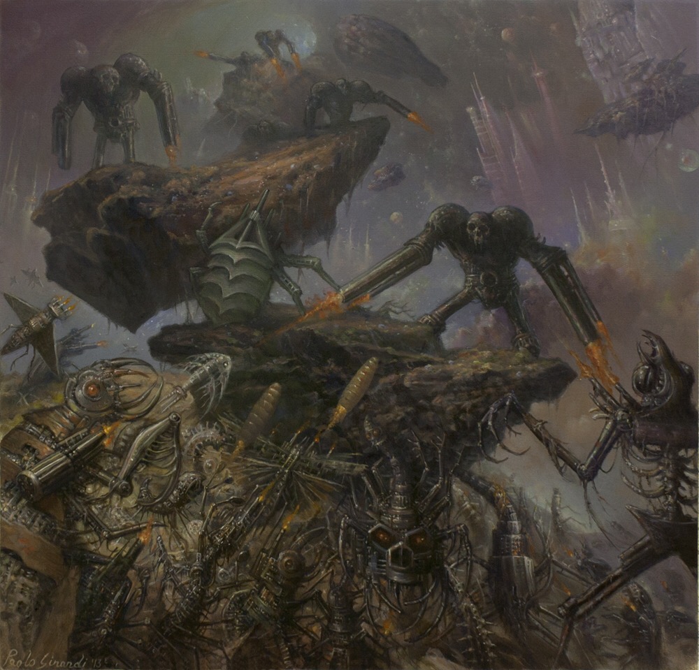
Having one of the most manic covers released this year Artificial Brain portray the cacophony of their music perfectly. With the cover our sleeve showing an intergalactic war, in the style of the celebrated Warhammer but given a truly adult nature. The harsh tones that the artist employed, with a mixture of murky colours and the vast concentration of so many objects in such a small space the artwork is the perfect tableau for Artificial Brain’s dissonant, simultaneously beautiful and ugly aura.
2 – Revocation – Deathless

After signing with metal blade revocation bounced back with this years release Deathless. Drawn up by artist Tom Strom the overall feel of the album is matched totally by Strom’s creation. Forsaking last year pretty terrible artwork for something that really gets under the skin an everlasting reminder that Revocation have indeed grown up but have also been experimenting with darker themes, darker melodies perhaps you could argue if there was a different album cover then I might think differently of the band. Album art in itself is such an important part, not just packaging for the record it sets the tone of the slbum and Tom Strom did an absolutely stellar job.
3 – Obituary – Inked In Blood

As mentioned previously in this post an album covers purpose is to embody all that the album entails. With Obituary’s rip roaring comeback this year, Inked In Blood had the perfect album artwork. Depicting a pretty unfortunate torso that looked like it went a few rounds with both Freddy and Jason it showed exactly what you would be getting yourself into. Without stepping into the almost comical slam bloodbaths Obituary retained a sense of what would be fitting for them as a band. A perfect picture of being at once an old throwback whilst a look to newer greener pastures.
4 – At The Gates – At War With Reality

Similarly to our previous post after a nineteen year vanishing act At The Gates returned this year with one of the strongest come back albums in a long time. With the concept of the album being reality and it’s impossibility the cover shows two symmetrical hands, that not only work as hands but on further inspection contain heads inside. Giving the album an overall philosophical feel, with the contrast of the grey along with the structure of the hands against the harsh black gave the album a truly obsidian feel. Along with deciding to return to heir roots with previous logo gave a feeling that it his was a band that was ready to return to the fore. Evolved whilst still containing the musical fire that made them such classics in the first place.
5 – Cannabis Corpse – From Wisdom to Baked

Now we see a band that began as a parody, members of Municipal Waste collaborated to form he weed soaked Cannabis Corpse. A hazy tribute to all the fantastic old school dean metal bands out there. Releasing their album this year and deciding to include death metal royalty artist Par Olofsson to design their new artwork they couldn’t have topped it. Showing a family very much similar to the iconic Sawyers of The Texas Chainsaw Masssacre Olofsson crafted something both sinister whilst ensuring that the fun remained. The B- movie of metal delivered the goods with this probably being their most accomplished record to date. Once again encapsulating the ethos of the band Olofsson brought something truly carnival like to these weed loving horror worshippers.
6 – Mastodon – Once More ‘Round The Sun

Mastodon have always had breathtaking artwork. Throughout their entirety as a band the group have pushed the boundaries. With their monumental con let albums needing a fitting imagery from the first four element based albums. Remission (fire) Leviathan (water) Blood Mountain (Earth) and finally the progressive Crack The Skye (air) the band then changed direction once again and decided to have a hand made wooden sculpture of their new album The Hunter. Now having released their new record, showing a side that is a more radio friendly Mastodon however never leaving their out there roots the band gave us an album cover that showed what could only be seen as a universe dragon. Their take on the classic ting yang, with one piece of the artwork being vivid colours contrary to the other where it was a lot more drab, eerie and ethereal. A perfect visual companion for the album.
7 – Beyond Creation – Earthborn Evolution

Returning this year Canadian geniuses crafted the fantastic Earthborn Evolution. After releasing 2012’s The Aura the band return, evident in their artwork that they are sticking with the sci-first metropolis theme a la Giger. What is crucial here though is the realisation that although the artwork may not be truly inspired it’s a perfect representation of the band. Beginning with e slightly clunky The Aura then band return with a tuned up, streamlined version of themselves. Confirming their identity as a band, so it seems fitting to remain in the same genre but just have the artwork improved. This time round Earthborn Evolution echoes a realisation that Beyond Creation are true players in the technical death metal arena. A statement of intent, brilliantly encapsulated. Not to mention a perfect flame for the metal moths to gravitate towards!
8 – Fallujah – The Flesh Prevails
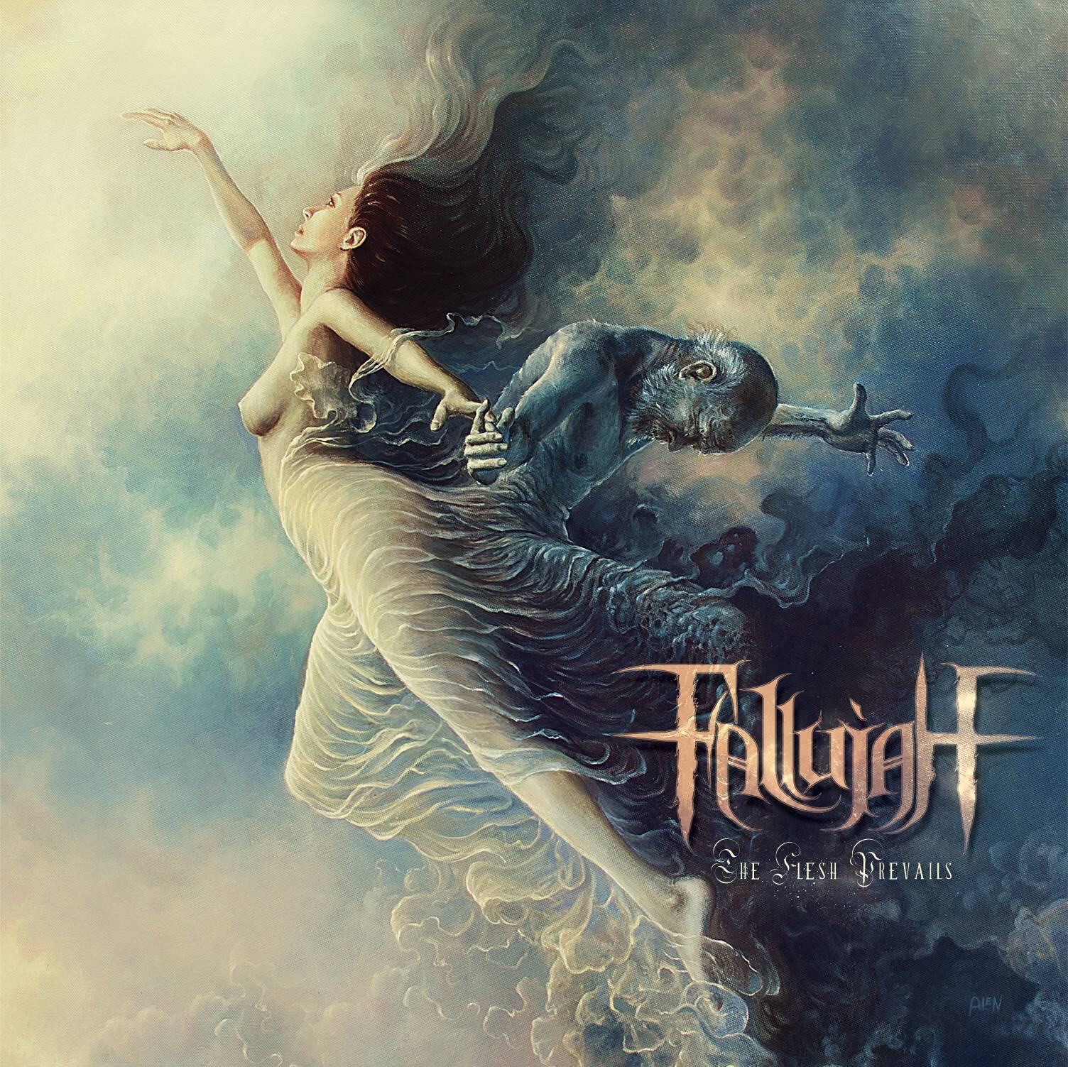
Following on of course is the beautiful work of Tomasz Alan Kopera in Fallujah’s spellbinding new effort The Flesh Prevails. Similar to number 6 in our list the album echoes the idea of negative and positive, good and evil, man and woman. Particularly pertinent in the album as Fallujah are the first band to combine a sense of ethereal shoe gaze and punishingly brutal, yet refined death metal. It simply makes the album itself even better.
9 – Cannibal Corpse – A Skeletal Domain

A particular favourite of mine this year was Cannibal Corpse’s new release. Many fans slated the artwork for the thirteenth outing of the band. Sticking the classic brush strokes of Vincent Locke the band decided to go for a more held back approach, of course with Cannibal Corpse having such an extreme reputation for creating some of the most vile album covers in metal (see what I did there). I personally commend the band for trying a new direction, once again mirroring the band at this stage in their career. Slowly evolving, A Skeletal Domain is arguably the most mature Cannibal Corpse record to date. Locke personified it’s sense of ominous post apocalyptic doom perfect win the effigys vomiting out lava along with the skeletal remains of what was humanity.
And finally for number ten we come to
10 – Behemoth – The Satanist

Returning at the very beginning of this year with The Satanist it was rumoured that frontman Nergal had indeed added his blood to the painting that was chosen for the final product. With it being one of the biggest releases of Behemoth’s career the album was issued in various different forms, the bog standard key spelling the albums title, to the special edition showing a face to the violence of the vinyl showing an a character all too ready to strike.
What the two final editions share is the lack of ability to distinguish what it is. At first glance the album seems simply to just be a painting of someone’s face. However, like the album itself, delve deeper and more genius emerges. The subtle use of contrast here and there, using darker shades to create a seemingly layered effect giving the distorted head prominence, whilst it being shrouded in what look like birds wings along with some form of moustache perhaps? Gives it a feeling of an elder, adding the hollow eyes creating the sense that the painting isn’t in fact only looking at you but it’s burning gaze moving to your very soul. A fantastic representation, grandiose as it is disturbing, mysterious as it is captivating. Truly one of the best pieces of metal artwork out there.
What do you guys think? Are we being a little over the top, what were your favourites this year? Is less sometimes more, more or less? Let us know!
